What Is an Executive Dashboard & Why Every Support Center Needs One
Anita
August 26, 2026
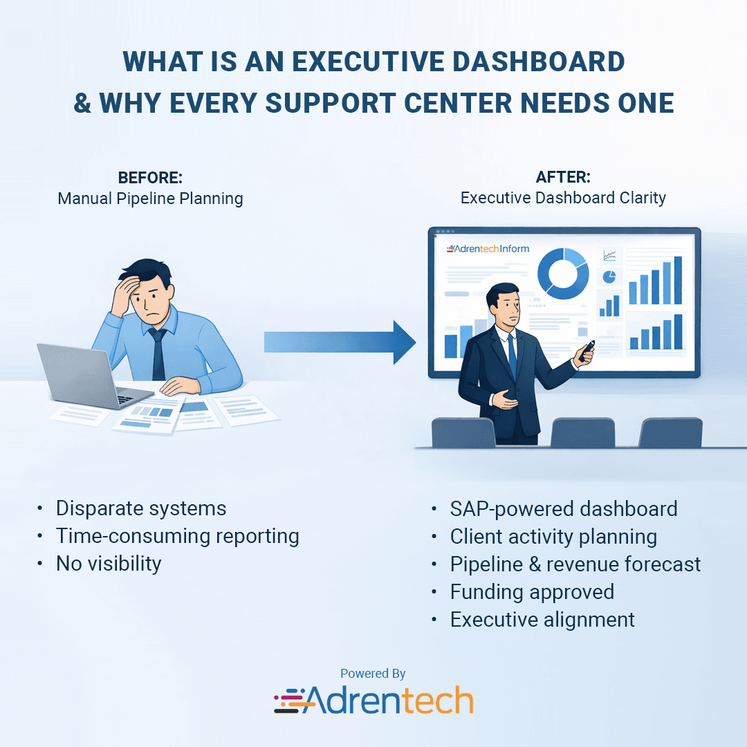
What Is an Executive Dashboard & Why Every Support Center Needs One
Support centers generate enormous amounts of data.
Every call, chat, ticket, transfer, escalation, cancellation, sale, complaint, and customer interaction creates another signal about what is happening inside the business.
The problem is rarely a lack of data.
The problem is knowing which signals matter right now.
An executive does not need to inspect thousands of individual conversations to understand whether customer satisfaction is declining. A VP of Customer Care should not need five spreadsheets to discover that cancellations increased after a pricing change. And a support director should not have to wait until the end of the month to learn that one work group is consistently underperforming.
That is the role of an executive dashboard.
An executive dashboard is a high-level reporting interface that brings the most important key performance indicators, trends, risks, and changes into one view so leaders can understand business performance and decide where action is needed.
In a support center, that means connecting operational metrics such as call volume, resolution, customer satisfaction, and agent performance with larger business outcomes such as retention, churn, revenue, customer experience, and operational efficiency.
The best executive dashboards do not simply answer:
“What happened?”
They help leaders answer:
“What changed, why does it matter, and where should we look next?”
Table of Contents
- What Is an Executive Dashboard?
- What Is an Executive Support Center Dashboard?
- Executive Dashboard vs Operational Dashboard
- Why Support Centers Need Executive Dashboards
- What Should an Executive Dashboard Show?
- The Most Important Support Center KPIs for Executives
- How an Executive Dashboard Turns Metrics Into Decisions
- What Does a Good Executive Dashboard Look Like?
- Why Context Matters More Than More Metrics
- How AI Is Changing Executive Dashboards
- From Dashboard to Natural Language Analytics
- How to Build an Executive Dashboard for a Support Center
- Common Executive Dashboard Mistakes
- FAQ
What Is an Executive Dashboard?
An executive dashboard is a visual reporting tool that gives senior leaders a concise view of the KPIs, trends, exceptions, and business outcomes they need to monitor organizational performance.
Unlike detailed reports, an executive dashboard is designed for rapid interpretation.
A leader should be able to open it and quickly understand:
- Are we meeting our targets?
- What changed?
- Is performance improving or declining?
- Where is the biggest risk?
- Which team, product, channel, or process is driving the change?
- Does something require immediate attention?
That distinction is important.
A dashboard containing 50 charts is not automatically more useful than one containing 10.
The purpose of an executive dashboard is not to show everything the organization can measure.
It is to reduce complexity without hiding what matters.
What Is an Executive Support Center Dashboard?
An executive support center dashboard gives senior leaders a high-level view of customer support performance, customer experience, operational efficiency, and emerging customer issues.
It can combine information from multiple sources, including:
- voice calls;
- chat;
- SMS;
- email;
- support tickets;
- self-service;
- customer surveys;
- CRM data;
- quality evaluations;
- sales and retention outcomes;
- agent performance data.
Instead of reviewing these channels separately, leadership gets one view of what is happening across the support organization.
Consider a cable or telecommunications provider handling thousands of interactions every day.
One system may know that call volume increased.
Another knows that cancellations increased.
Another contains customer satisfaction scores.
The call transcripts contain the reason customers are unhappy.
Looking at those sources individually gives leadership pieces of the story.
An effective executive dashboard connects them.
It might show that:
call volume increased 14% → billing contacts increased → cancellation requests increased → negative sentiment increased → most affected customers mention a recent price change.
That is considerably more useful than simply knowing that 80,000 calls occurred.
Executive Dashboard vs Operational Dashboard
Executive and operational dashboards serve different audiences and different decisions.
An operational support dashboard helps supervisors manage what is happening inside the operation.
An executive dashboard helps senior leaders understand what is happening to the business because of the operation.
Operational dashboards answer questions such as:
- How many calls are waiting?
- What is today's average handle time?
- Which queues are above capacity?
- How many agents are available?
- Are we meeting the SLA?
- What is the abandonment rate?
These metrics are essential for managing day-to-day support.
Executive dashboards answer broader questions:
- Why has contact volume increased this month?
- Is customer satisfaction deteriorating?
- Which issues are driving repeat contacts?
- Are cancellations increasing?
- Is retention performance improving?
- Which customer problems represent the greatest business risk?
- Which support teams are improving or declining?
- Did a product or policy change create a new contact driver?
The same underlying data may contribute to both dashboards.
What changes is the level of abstraction and the decision being supported.
Why Support Centers Need Executive Dashboards
A modern support center is one of the richest sources of customer intelligence inside an organization.
Customers tell support teams when:
- products fail;
- instructions are confusing;
- bills are unexpected;
- competitors have better offers;
- self-service does not work;
- policies create frustration;
- installation experiences go wrong;
- prices feel too high;
- they are considering leaving.
Yet much of this information remains buried inside conversations.
Traditional reporting often reduces those interactions to counts:
72,410 calls.
6:42 average handle time.
82% service level.
4.3 customer satisfaction.
Useful?
Yes.
Complete?
Not even close.
An executive dashboard should preserve those quantitative KPIs while helping leadership understand the business story behind them.
Faster visibility into problems
Without a shared dashboard, performance problems may surface through monthly reporting.
By then, thousands of customers may already have experienced the issue.
A dashboard makes changes visible earlier.
One shared version of performance
Leadership meetings often become surprisingly complicated when teams use different reports, definitions, and timeframes.
A centralized executive dashboard creates a common reference point.
Better prioritization
Not every change deserves the same attention.
A 2% increase in handle time may matter less than a sudden increase in cancellation requests.
Executive reporting helps separate operational noise from meaningful business changes.
Connection between support and business outcomes
Support should not exist in reporting isolation.
Customer interactions influence retention, revenue, loyalty, operating cost, and brand perception.
Executive dashboards help make those relationships visible.
What Should an Executive Dashboard Show?
A useful executive dashboard should answer four questions.
1. What is happening?
Start with the core KPIs.
For example:
- total interactions;
- call volume;
- resolution rate;
- customer satisfaction;
- first contact resolution;
- repeat contact rate;
- retention rate;
- cancellation rate.
2. What changed?
A number without comparison has limited meaning.
Suppose the dashboard shows:
Cancellation rate: 7.8%
Is that good?
Bad?
Normal?
Leadership needs context.
A better dashboard shows:
Cancellation rate: 7.8%
Previous month: 5.9%
Change: +1.9 percentage points
Now there is a signal.
3. Why did it change?
This is where many dashboards stop being useful.
Knowing that cancellations increased is not enough.
Leadership needs to understand the drivers.
For example:
Top cancellation reasons
- Price increase
- Moving
- Competitor offer
- Service reliability
- Product dissatisfaction
Now the metric begins to support a decision.
4. Where should we investigate?
The final layer is segmentation.
Perhaps the increase is concentrated in:
- one product;
- one customer segment;
- one geography;
- one queue;
- one work group;
- one channel;
- one period.
An executive dashboard should make it easy to move from the enterprise-level signal to the segment responsible for the change.
The Most Important Support Center KPIs for Executives
There is no universal set of executive dashboard KPIs.
The right metrics depend on the organization's objectives.
But support leaders should generally consider metrics across several categories.
Customer Demand
These metrics explain how much support customers require and why.
Useful measures include:
- interaction volume;
- contact rate;
- contact reasons;
- channel distribution;
- repeat contact rate;
- emerging contact drivers.
Volume alone is rarely enough.
If calls increase 20%, leadership needs to know what caused the increase.
Customer Experience
These metrics help show how customers experience support.
Common examples include:
- customer satisfaction (CSAT);
- first contact resolution (FCR);
- repeat contacts;
- escalation rate;
- complaint rate;
- customer sentiment.
These metrics should be evaluated together.
A team may reduce average handle time while simultaneously increasing repeat contacts.
The first metric looks positive.
The customer outcome does not.
Operational Performance
Executives do not need every workforce metric, but they need enough operational context to understand performance.
Useful measures can include:
- average handle time;
- service level;
- abandonment rate;
- transfer rate;
- resolution time;
- backlog;
- agent utilization.
These metrics are especially useful when they explain a larger business change.
Quality
Quality metrics help determine whether customers receive the right experience, not merely a fast one.
These can include:
- quality evaluation scores;
- compliance;
- verification behaviors;
- communication quality;
- process adherence;
- coaching opportunities.
Retention and Churn
For retention teams, executive reporting can include:
- cancellation requests;
- save attempts;
- retention rate;
- retention outcomes;
- churn risk;
- cancellation reasons;
- reasons retention was not attempted.
These metrics connect support activity directly to customer value.
Sales and Revenue Opportunities
When support interactions also contain commercial opportunities, leadership may track:
- sales intent;
- conversion rate;
- closed sales;
- upsell opportunities;
- non-close reasons;
- transfer-to-sales rate.
Again, the reason behind the metric often matters more than the metric alone.
If conversion drops from 18% to 12%, the immediate executive question is:
Why?
How an Executive Dashboard Turns Metrics Into Decisions
Consider a support organization where the dashboard reports:
Call volume: +18%
That is information.
Now add:
Billing calls: +31%
That is context.
Then:
42% of the increase relates to customers questioning a new fee.
That is insight.
Finally:
Customers mentioning the fee show a higher cancellation-request rate.
Now leadership has something actionable.
The sequence is:
Metric → Change → Driver → Impact → Action
That is what executive analytics should accomplish.
The dashboard is not valuable because it contains charts.
It is valuable because it shortens the distance between something changing and someone understanding why.
What Does a Good Executive Dashboard Look Like?
A good executive dashboard is intentionally selective.
It should make important changes obvious without forcing leaders to analyze every metric manually.
The first view should prioritize:
Core KPIs
What are the handful of metrics that define support health?
Trends
Are those metrics improving or deteriorating?
Comparisons
How does current performance compare with the previous period, target, or benchmark?
Exceptions
Which metric has moved far enough to require attention?
Drivers
What explains the change?
Segments
Where is the issue concentrated?
Drill-down
Can leadership investigate the underlying teams, interactions, or conversations?
The dashboard should work in layers.
The first layer tells you:
Something changed.
The second tells you:
This is where it changed.
The third tells you:
This is probably why.
And when necessary, the final layer lets analysts or managers inspect the underlying evidence.
Why Context Matters More Than More Metrics
One of the easiest dashboard mistakes is assuming that more data produces more insight.
It often produces the opposite.
Imagine seeing:
CSAT: 82%
Now compare that with:
CSAT: 82% ↓ 6% vs previous month
Better.
Now:
CSAT: 82% ↓ 6% vs previous month
Largest decline: Internet Support
Better again.
And finally:
Internet Support CSAT decline correlates with increased contacts about intermittent connectivity after a recent equipment update.
That is an executive insight.
The metric did not change.
The context around the metric changed.
For executive reporting, every major KPI should ideally have enough context to answer:
- Compared with what?
- Over what period?
- Which segment changed?
- What contributed to the change?
- What is the business impact?
How AI Is Changing Executive Dashboards
Traditional dashboards depend heavily on predefined metrics.
Someone decides which questions matter, creates a report, builds a chart, and adds it to the dashboard.
But support operations change constantly.
Tomorrow's most important customer problem may not have a predefined chart.
Artificial intelligence introduces another layer to support analytics.
Instead of analyzing only structured fields, AI can analyze the content of customer conversations.
That means thousands of calls and chats can become structured information.
For example, AI can help identify:
- primary contact reasons;
- emerging customer issues;
- cancellation reasons;
- sales intent;
- customer sentiment;
- recurring complaints;
- agent behaviors;
- product problems;
- knowledge gaps;
- root causes.
This makes executive dashboards significantly more contextual.
Instead of showing only:
Cancellation requests increased 17%.
The dashboard can potentially explain:
Cancellation requests increased 17%, primarily driven by pricing concerns among customers discussing video services.
That is a different level of reporting.
From Dashboard to Natural Language Analytics
AI also changes how executives interact with analytics.
A traditional dashboard requires the user to find the right report, filter, chart, and segment.
Natural language analytics introduces another possibility:
Ask the data directly.
An executive might ask:
What were the top reasons customers contacted support last month?
Or:
Why did cancellation requests increase this week?
Or:
Which work group had the largest decline in customer satisfaction?
Or:
What are customers saying about our new internet plan?
Or:
What are the most common reasons sales opportunities do not close?
The system can translate those questions into analysis across structured metrics and, where available, customer conversations.
This does not eliminate dashboards.
It changes their role.
The dashboard becomes the starting point for discovery.
Natural language becomes the interface for deeper investigation.
How to Build an Executive Dashboard for a Support Center
The best place to start is not with charts.
Start with decisions.
Step 1: Identify the Audience
A CEO, VP of Customer Care, support director, and frontline supervisor do not need identical dashboards.
Define who will use the dashboard and what decisions they make.
Step 2: Define the Questions
Before choosing KPIs, write down the questions leadership needs answered.
For example:
- Is customer demand increasing?
- Are customers getting their issues resolved?
- What is driving cancellations?
- Which teams need attention?
- Are we improving customer satisfaction?
- Where are repeat contacts coming from?
Step 3: Choose the KPIs
Select metrics that directly support those questions.
Avoid adding a metric simply because it is available.
Step 4: Add Comparisons
Show performance against:
- previous period;
- target;
- historical baseline;
- relevant business segment.
Step 5: Add Drivers
Whenever a metric changes significantly, provide a way to understand why.
Step 6: Connect Channels
Customers do not think in reporting silos.
Where possible, combine calls, chat, messaging, tickets, and self-service into a broader view of the customer experience.
Step 7: Allow Drill-Down
Executives need simplicity.
Analysts need evidence.
A dashboard should support both by allowing users to move from a high-level KPI into the underlying segments and interactions when necessary.
Step 8: Review the Dashboard Regularly
Business priorities change.
A dashboard designed two years ago may still be measuring yesterday's priorities.
Remove metrics that no longer influence decisions and add new ones only when they answer an important business question.
Common Executive Dashboard Mistakes
Showing Too Many Metrics
More KPIs can make the important ones harder to see.
Reporting Numbers Without Context
A metric without a target, trend, or comparison often tells leadership very little.
Treating an Executive Dashboard Like a Supervisor Dashboard
Senior leadership should not need to interpret queue-level operational noise to understand organizational performance.
Focusing Only on Averages
Averages can hide serious problems.
An acceptable company-wide CSAT score may contain one customer segment with rapidly declining satisfaction.
Measuring Activity Instead of Outcomes
Tickets closed and calls handled measure activity.
Resolution, retention, satisfaction, and repeat contacts say more about outcomes.
Separating Metrics From Customer Conversations
Structured data tells you what happened.
Customer conversations often help explain why.
Creating Dashboards Without Drill-Down
When a KPI changes, the natural next question is:
Why?
If the dashboard cannot help answer that question, leaders return to manual reports.
The Executive Dashboard Is Becoming a Decision Interface
For years, dashboards were primarily visualization tools.
They took rows of data and turned them into charts.
That is still useful, but modern support organizations can go further.
A support center produces two valuable forms of information:
structured performance data and unstructured customer conversations.
Combining them changes what executive reporting can answer.
Leadership can move from:
How many customers called?
to:
Why are more customers calling?
From:
How many customers cancelled?
to:
What reasons are driving cancellations?
From:
Did CSAT decline?
to:
Which customer problems contributed most to the decline?
And from:
Which team is underperforming?
to:
Which behaviors or interaction types are associated with that performance?
That is why an executive dashboard should not be designed as a collection of charts.
It should be designed as a decision interface.
Its job is to compress thousands or millions of customer interactions into a small number of signals leaders can understand — while preserving the ability to investigate the evidence behind them.
For support centers, that makes the dashboard more than a reporting tool.
It becomes a way to hear what customers are telling the organization at scale.
FAQ
What is an executive dashboard?
An executive dashboard is a high-level reporting interface that presents the most important KPIs, trends, risks, and business outcomes in one view so senior leaders can quickly understand performance and identify where action is needed.
What is an executive dashboard used for?
Executive dashboards are used to monitor organizational performance, identify important changes, compare results against targets or previous periods, uncover risks, and support strategic decision-making.
What should be included in an executive dashboard?
An executive dashboard should include a focused set of strategic KPIs, trends, comparisons, targets, exceptions, and relevant business drivers. The exact metrics should reflect the decisions its audience needs to make.
What should an executive dashboard include for customer support?
A support center executive dashboard may include interaction volume, customer satisfaction, first contact resolution, repeat contacts, retention, cancellations, quality scores, service level, average handle time, escalation rate, agent performance, contact reasons, and emerging customer issues.
What is the difference between an executive dashboard and an operational dashboard?
An operational dashboard focuses on day-to-day execution, such as queue volume, staffing, service levels, and current workload. An executive dashboard focuses on strategic performance, trends, risks, customer outcomes, and business impact.
What are the most important customer support KPIs for executives?
Important KPIs can include customer satisfaction, first contact resolution, repeat contact rate, interaction volume, retention, cancellation rate, resolution performance, quality, and customer contact drivers. The best set depends on the organization's strategic objectives.
How can AI improve an executive dashboard?
AI can analyze unstructured customer conversations alongside traditional metrics to identify contact reasons, customer sentiment, cancellation drivers, emerging issues, agent behaviors, and other patterns. Natural language analytics can also allow leaders to investigate dashboard findings by asking questions directly.
Is an executive dashboard the same as a KPI dashboard?
They overlap, but not every KPI dashboard is an executive dashboard. A KPI dashboard displays performance metrics, while an executive dashboard specifically prioritizes the strategic metrics, trends, risks, and context senior leaders need to make decisions.
How often should an executive dashboard be updated?
Update frequency should match the decision being supported. Operationally sensitive information may require real-time or near-real-time data, while strategic trends may be evaluated daily, weekly, monthly, or quarterly.
Why are executive dashboards important for support centers?
Support centers generate large amounts of customer and operational data. An executive dashboard brings the most important signals together so leadership can identify changes in customer demand, experience, retention, performance, and emerging issues without manually reviewing multiple reports or individual interactions.
Internal Linking Recommendations
Add contextual internal links from this article to:
- The Complete Guide to Support Center KPIs & Executive Dashboards
- Why Every Support Team Needs a Call Center Dashboard (Metrics That Matter)
- Top Metrics to Track for Knowledge Base Performance
Recommended anchor text:
support center KPIscall center dashboard metricsknowledge base performance metricscustomer support analyticsexecutive reporting
Also add links back to this article from existing dashboard and KPI content using anchors such as:
executive dashboardexecutive support dashboardexecutive dashboard for customer support
Featured Snippet / AI Answer Target
What is an executive dashboard?
An executive dashboard is a high-level reporting interface that consolidates key performance indicators, trends, risks, and business outcomes into one view. It helps senior leaders quickly understand performance, identify meaningful changes, and determine where action or deeper investigation is needed.
Image Recommendation
Image concept: Executive support center dashboard showing Customer Experience, Contact Volume, Retention, Resolution, Quality, and Emerging Issues, with the ability to drill from a KPI into underlying customer conversations.
Alt Text: Executive support center dashboard showing customer service KPIs, trends, retention, quality, and customer experience metrics.
Caption: An executive support center dashboard connects high-level KPIs with the trends and customer issues driving performance.
Share on social media


SpeechMiner Alternative in 2026: Why Adrentech Inform Goes Beyond Traditional Speech Analytics