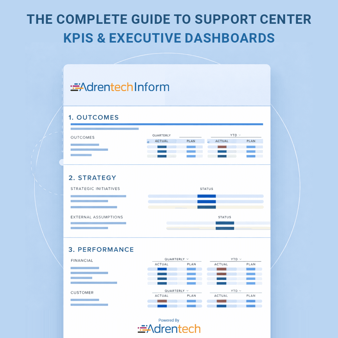
The Complete Guide to Support Center KPIs & Executive Dashboards
Anita
May 18, 2026
- What executive dashboards actually are
- Why support center reporting usually becomes noise
- The difference between metrics and decisions
- Which KPIs actually matter in support operations
- How executive dashboards improve decision-making
- What makes an effective executive dashboard
- Why real-time reporting changes support operations
- Where executive reporting often fails
- Reporting best practices that actually help
- Final thoughts — dashboards should tell a story
The Complete Guide to Support Center KPIs & Executive Dashboards
A dashboard with 47 charts usually means one thing:
No one knows what actually matters.
Support centers generate massive amounts of data. Calls, tickets, customer satisfaction scores, handle time, staffing metrics, escalation rates. Everything gets tracked. Everything gets reported.
And somehow, executives still struggle to get a clear picture of performance.
That’s the real problem executive dashboards are supposed to solve.
What executive dashboards actually are
An executive dashboard is a centralized visualization tool that helps executives monitor KPIs, business performance, and operational trends in real time.
At least, that’s the goal.
A good executive dashboard gives senior management a big-picture overview of an organization’s operations without forcing them to dig through spreadsheets or internal reports.
It combines:
- key performance indicators
- reporting data from multiple sources
- performance trends
- operational insights
Into one place.
Not to overwhelm people. To help them make informed decisions quickly.
Summary: Executive dashboards turn scattered business data into actionable visibility.
Why support center reporting usually becomes noise
Most reporting processes fail because they focus on compiling information instead of creating understanding.
There’s a difference.
A support center may track dozens of KPIs:
- response time
- ticket volume
- customer satisfaction
- agent utilization
- escalation rates
But if stakeholders can’t identify areas for improvement from the report, the dashboard becomes decoration.
Pretty visualization. No decision-making value.
That happens more often than companies admit.
Summary: Reporting becomes noise when metrics are disconnected from decisions.
The difference between metrics and decisions
A metric tells you what happened.
A decision tells you what to do next.
That distinction matters.
For example:
- rising handle time might indicate training issues
- lower customer satisfaction may reflect staffing shortages
- increased ticket backlog could signal workflow problems
Without context, KPIs are just numbers.
An effective executive dashboard connects data points to operational meaning.
That’s what executives actually need.
Summary: Metrics only become valuable when they support decisions.
Which KPIs actually matter in support operations
Support center KPIs should reflect both operational efficiency and customer experience.
Not vanity metrics.
The most useful key performance indicators usually include:
- customer satisfaction
- first response time
- resolution time
- ticket backlog
- escalation rate
- agent productivity
Some executive dashboard examples also include financial performance or operational cost metrics, especially when support impacts broader business performance.
The important part is balance.
Too much operational focus ignores customer experience. Too much CX focus ignores sustainability.
Summary: The best KPIs balance operational performance with customer outcomes.
How executive dashboards improve decision-making
Executive dashboards improve decision-making by making complex information easier to interpret.
That sounds simple. It’s actually difficult.
Executives don’t need every detail. They need relevant information presented clearly enough for quick review.
A strong dashboard and reporting setup helps:
- identify areas for improvement
- monitor business performance across the organization
- compare quarterly performance trends
- visualize operational risks before they escalate
This is especially important in support environments where conditions change quickly.
Real-time visibility changes response speed.
Summary: Executive dashboards help leaders react faster and prioritize better.
What makes an effective executive dashboard
An effective executive dashboard focuses on clarity, relevance, and usability.
Not complexity.
The best executive reporting solutions usually:
- include the most relevant information only
- visualize trends instead of isolated numbers
- provide a big-picture overview without hiding details
- combine data from multiple systems
A dashboard should tell a dynamic story about performance.
Not just display charts.
Relevant stakeholders should be able to view a dynamic story of the company’s performance within seconds.
If they can’t, the dashboard probably needs simplification.
Summary: Effective dashboards prioritize clarity over volume.
Why real-time reporting changes support operations
Real-time reporting changes support operations because delays hide problems.
A quarterly executive report is useful for strategy.
But operational issues happen daily.
Real-time dashboards allow managers and directors to:
- track performance continuously
- identify workload spikes
- monitor customer experience trends
- detect service risks earlier
This improves operational agility and helps avoid employee burnout caused by hidden staffing issues.
Support environments move fast. Reporting needs to keep up.
Summary: Real-time dashboards improve visibility before problems become critical.
Where executive reporting often fails
Executive reporting usually fails when reports become too broad, too detailed, or too disconnected from operational reality.
Common problems:
- too many KPIs
- inconsistent reporting standards between departments
- dashboards built for analysts instead of executives
- lack of actionable insights
Sometimes teams focus so much on visualization that they forget usability.
A beautiful dashboard nobody understands is still a bad dashboard.
Summary: Reporting fails when complexity replaces clarity.
Reporting best practices that actually help
Good reporting best practices are surprisingly simple.
A few things consistently improve executive-level reporting:
- standardizing KPI definitions
- limiting dashboards to meaningful metrics
- integrating data from multiple sources
- keeping reports readable and fast to interpret
- aligning reporting with business goals
This is where modern analytics tools and reporting tools matter.
Platforms like Adrentech Inform are designed around this exact problem—helping executive teams move from raw support center data to clear operational insight without creating another layer of reporting chaos.
Because most companies don’t lack data.
They lack visibility.
Summary: Strong reporting systems reduce complexity instead of adding to it.
Final thoughts — dashboards should tell a story
Executive reporting refers to more than compiling charts into one screen.
It’s about helping people understand what’s happening across the organization.
The best executive dashboards don’t just track performance.
They explain it.
They help executives see:
- where performance improves
- where customer experience drops
- where operational pressure is building
And most importantly, they help people act before small issues become larger ones.
That’s what makes dashboards useful.
Not the number of widgets.
The clarity they create.
Share on social media


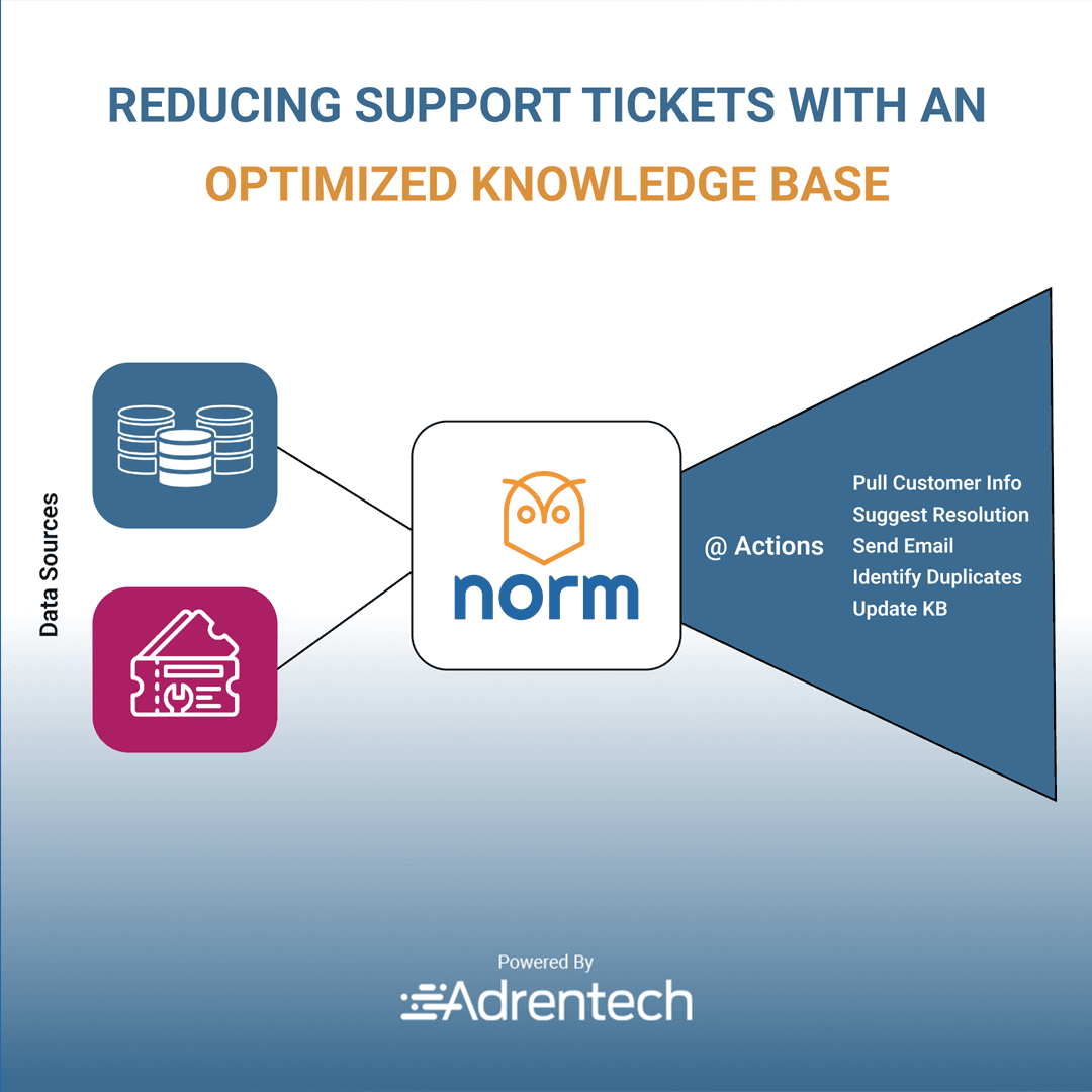
Reducing Support Tickets with an Optimized Knowledge Base